We recently completed a redesign for a healthcare ethics consultant.
This client has been in business for a long time. They have done some excellent work and helped a lot of people.
They’ve received many referrals from their network and many clients from their speaking arrangements. Not once though, they informed me, had they ever received a client from their website.
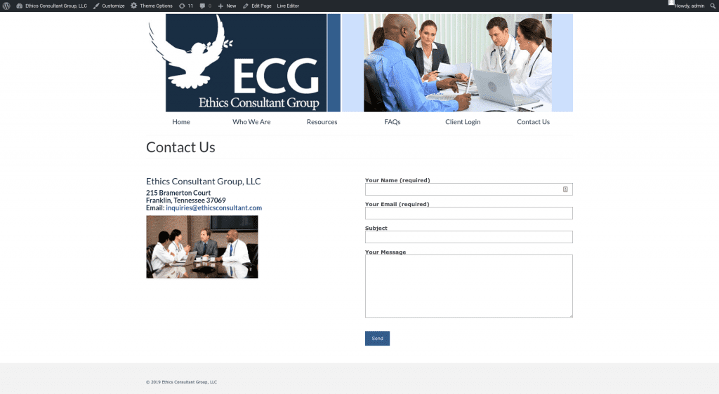
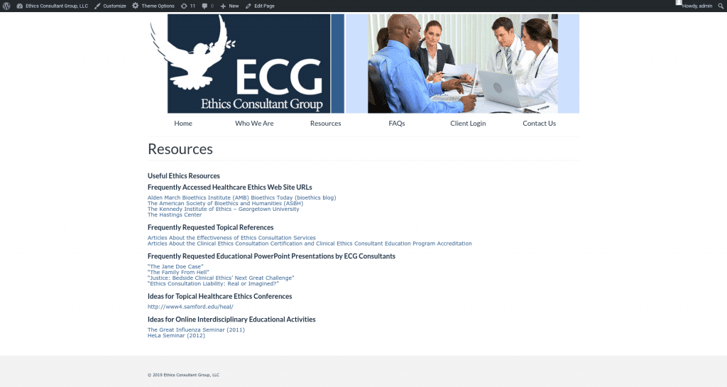
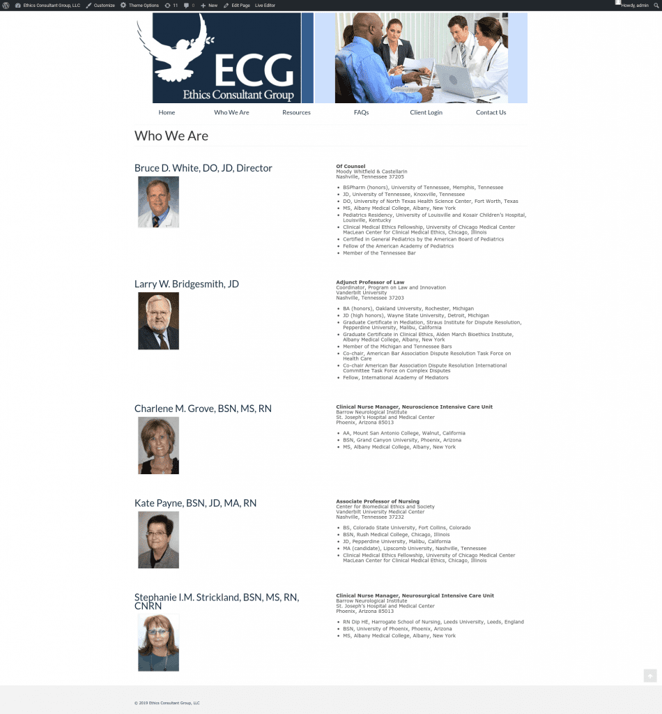
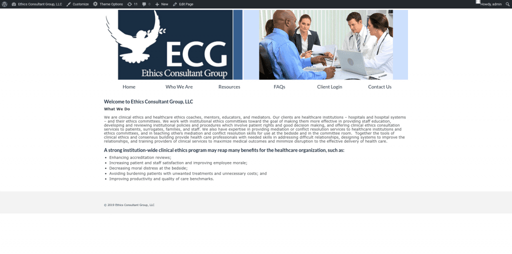
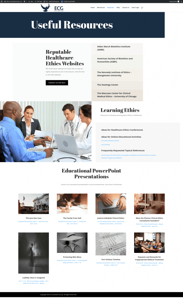
When I saw their website, I wasn’t shocked by this information. I don’t think you will be either. Here’s how it looked when I got control of it:
They had their website with GoDaddy. They purchased the GoDaddy hosting plan and paid an additional sum to GoDaddy to “design and build their website.”
How GoDaddy Managed Their Website Was Atrocious
GoDaddy charged a hefty fee for this “design” service.
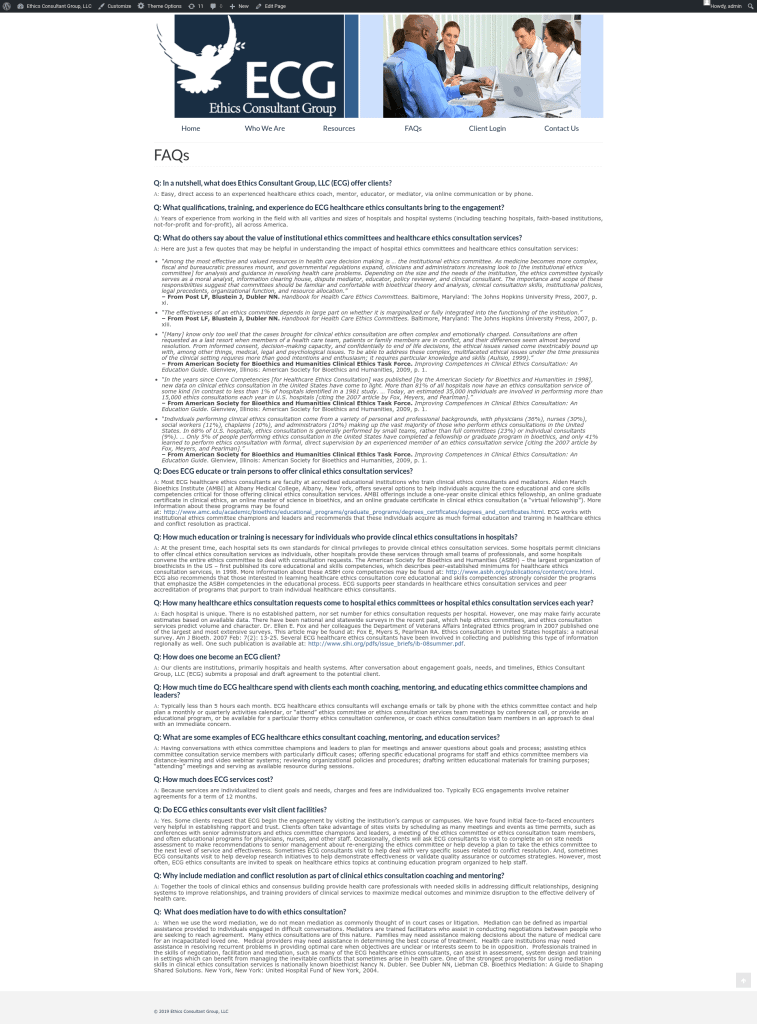
The Resources page looks like a link farm. The about page looks like a boring resume. The FAQs looked like a poorly organized Word doc. How is any visitor going to come to this site and get their questions answered?
All the links took the visitor away from the site instead of opening in a new tab. You always want the links to open in a new tab so your visitor doesn’t immediately leave your site. That’s not what you want to happen when you’re trying to get a client.
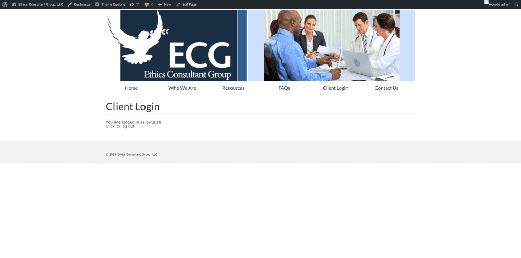
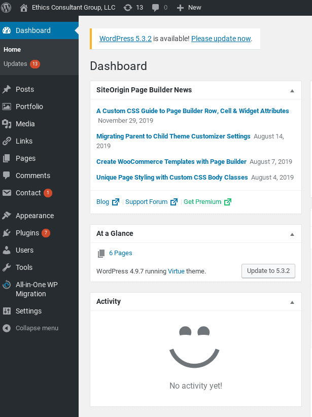
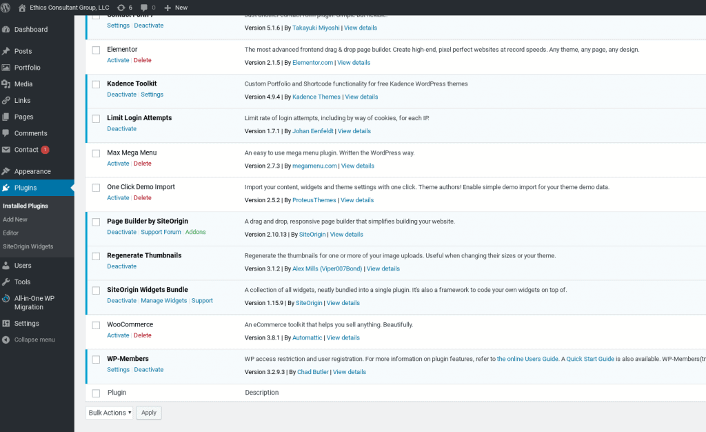
GoDaddy was also supposed to be maintaining the website for their fees. Here is what I found when I logged into the backend:
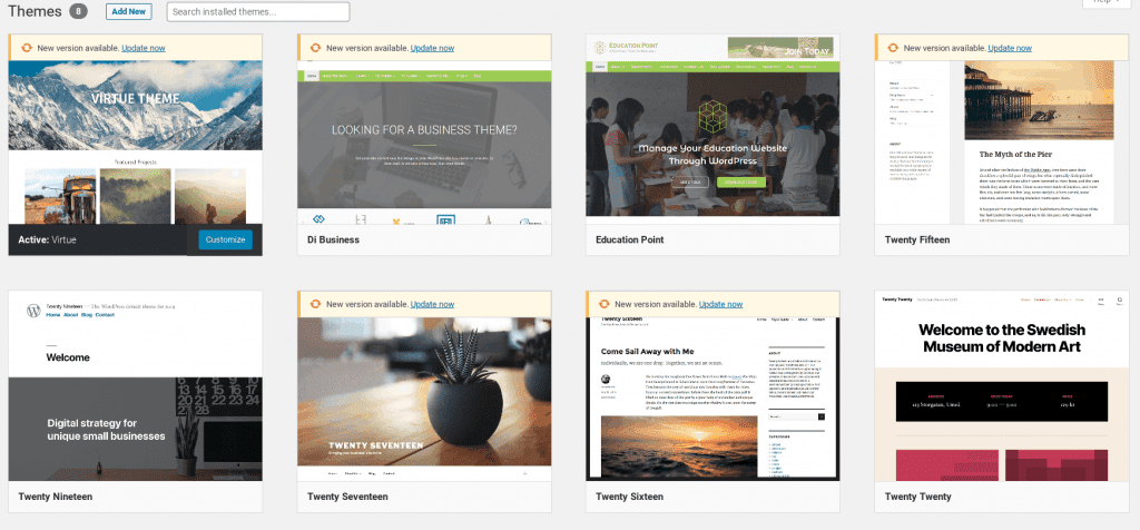
As you can see in the screenshots, they left our consultants’ website severely outdated with most plugins needing an update. There were numerous unused plugins and themes – which can be a serious security vulnerability, especially when not updated.
You can also see GoDaddy just picked a free theme from WordPress. And charged the client a lot for it.
That’s something you, dear reader, could do for free in under an hour after watching a YouTube tutorial on WordPress.
The Consultant Website Redesign Effort
I knew we needed to fix a lot on the website.
I focused primarily on aesthetics and communicating the client’s impact ability with concise copywriting.
For the website redesign, I incorporated more images. I used call-to-action (CTA) buttons to help visitors navigate the site and drive action towards our goal: scheduling a call with the healthcare ethics consultant client.
I worked with the client to extract their core value proposition and made sure to communicate that on the home page, where most visitors will get their first impression of the company.
The website security needed a boost, and that was fixed easily with excellent plugins available for WordPress. We recommend Wordfence and Cerber, which are both fantastic at protecting your site.
The primary goal with a website redesign is to improve the user experience (UX) in a way that will convert visitors to clients or customers.
Using key principles of design will help any website improve the user experience.
Our visitors have so many choices and they are only a quick search away from finding an alternative to what you offer. Because of this, you must communicate clearly and concisely why they should choose you. The best way to do that is with a good-looking website that engages your visitors with compelling copy.
So, that’s what we try to deliver for clients needing an upgrade.
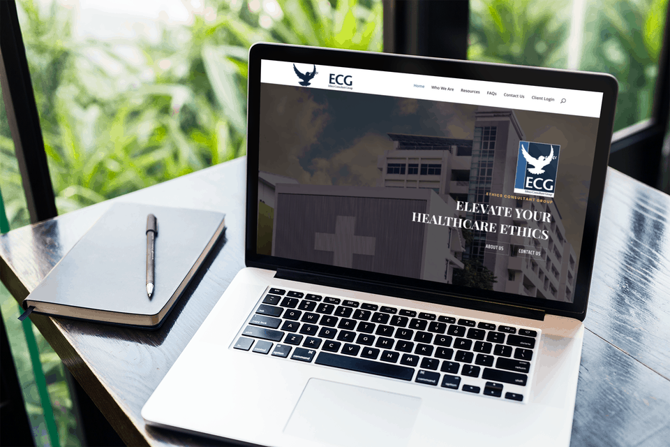
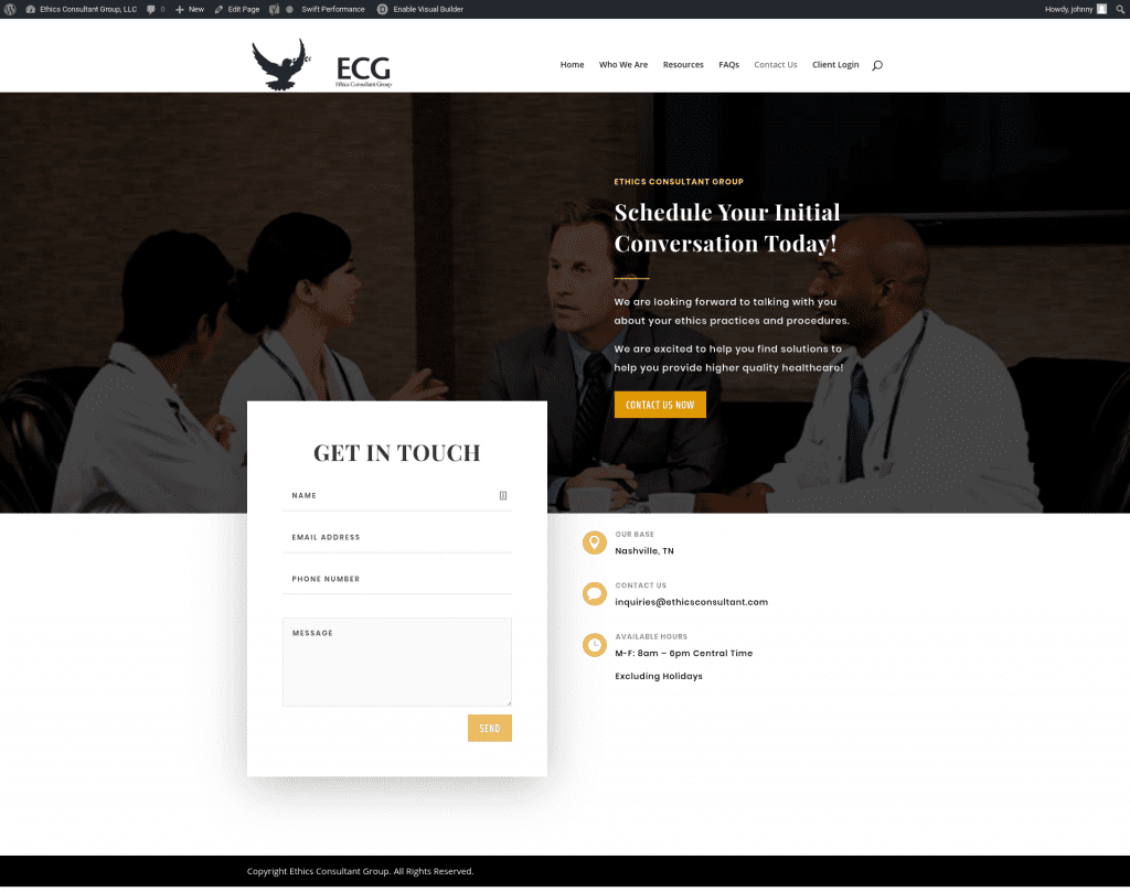
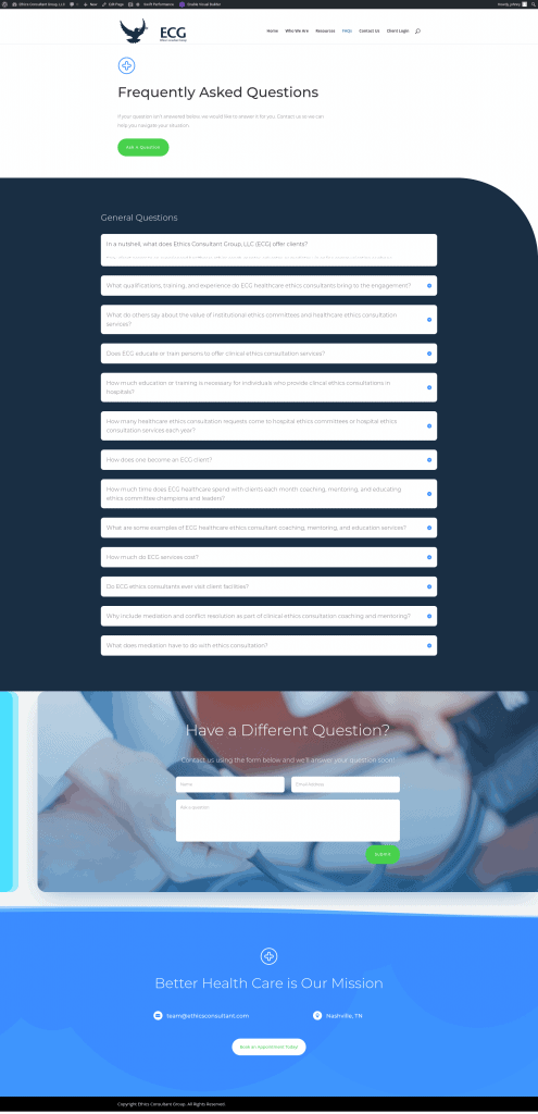
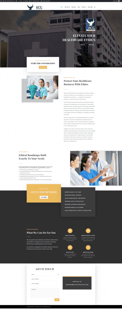
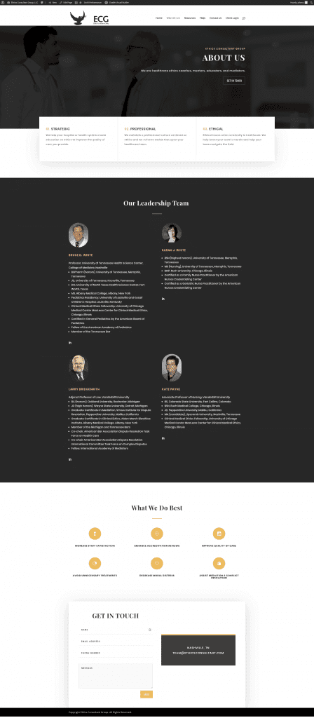
Here’s how our consultant website redesign looks now:
As you can see I used icons and highlights to get the client’s message across quicker. I made it easy to navigate an FAQ page by finding your question and clicking it for the answer. The resources page no longer looks like spam to Google and it’s easier for humans to find the resources they need too.
Ethics Consultant Group has a shiny new website, that I think is far more inviting to visitors. They might even get a client from the web now. It’s at least in the realm of possibility after the redesign.
So, are you ready to talk about redesigning your site? Are you ready to make a good impression online and improve conversions? Contact us to get started.
